Caravan UX Case Study
Spend too much driving your kids? Caravan’s here to help.
Indigo Design Awards; Silver Winner; UX, Interface & Navigation Category
Project Overview
Parents are often real-life superheroes, working hard to provide their children a life full of joy and opportunities. They support their kids in education and extracurricular activities so they can sharpen their knowledge, develop their social skills, and enrich their memories. Nonetheless, this inevitably requires parents to spend far too much time in the car. From my own family members to parents I babysit for, the complaint of spending too much time driving the kids is one I frequently hear. Thus, I decided to tackle the problem of parents spending too much time driving their children by exploring how parents can better utilize carpool coordination. The final service is an app, but below you will find the research that informed this solution.
The Problem
Parents spend too much time driving their children, largely because they lack a tool to easily coordinate carpool with other parents they know and trust.
Role & Scope
I spearheaded this five-week design project during an Experience Design course at TCU. I utilized design thinking methods to research and gather data, which I let drive my solution.
Competitive Analysis
-
A competitive analysis kickstarted the research process. In general, this research showed that current carpool apps utilize paid, unfamiliar drivers and don't allow for preemptive driving coordination, especially with multiple drivers.
-
Floc
Floc is an app to coordinate carpool with parents who know each other. It rewards people with gift cards and functions with invite-only carpool groups. Users send individual requests for rides. The app includes notifications but no location tracking;.
-
Carpool Kids
This is carpool coordination app that includes an event calendar and driving stats to show who is driving the most. Users complain that only one driver can sign up for an event.
-
-
Waze Carpool
This is an extension of the Waze navigation app . It’s not focused on the kids but rather for commuting adults. Drivers have ratings. It is a paid service
-
Hop Skip Drive
This is a website that costs money to use. It’s meant to coordinate carpool for kids ages 1-12. It utilizes "care drivers," who are not known and trusted adults. It provides notifications for each stage of the ride.
Survey
This custom survey was shared with parents via various social media platforms. The survey short so people would be more likely to complete it. The following data was gathered from 57 survey respondents.
Parents' complaints about driving their kids:
• Immediately having to drive kids after a long workday
• Waiting in the school carpool line
• Not enough carpool opportunities
• Kids going to different schools in different locations
• Using so much gas in traffic
Interviews
Interviewees included fathers and mothers who each have kids of different ages to ensure a well-rounded, diverse range of perspectives and input.
Interview Questions:
How much time do you spend in the car each week driving your kids?
How do you think the amount of time you spend driving your kids affects your life?
Tell me about your experiences coordinating carpool for your kids.
Tell me how you feel about your kids partaking in carpooling.
Say you plan on driving your kid to sports practice after school. Last-minute, you have an emergency meeting come up and can longer drive your child. What do you do?
How many other kids do you typically pick up when you're driving carpool?
What activities are your kids involved in that require you to drive them places?
If you had a magic wand to change anything about driving your children or coordinating carpool, what would you do?
Key Insights
Parents feel stressed because they spend so much time in the car driving their kids.
Parents are incredibly aggravated by the amount of time they spend driving their children. It leaves less time for self-care and increases stress. Traffic makes this worse. Therefore, the solution to this problem must involve a service that lessens the amount of time parents spend driving their kids.
Most school pickup systems are inefficient and waste time.
According to the five interviews, most parents wait in line to pick up their kids for 20-30 minutes per day. This becomes an even bigger problem when kids in the same family go to different schools. Parents would enjoy a system that allows them to spend less time sitting in line at school pickup.
Parents enjoy utilizing carpool with people they know and trust.
When a last-minute meeting comes up, parents tend to immediately text their spouses or friends to drive their kids. When their kids ride with known and trusted adults, parents feel comfortable and thankful for carpool. Parents want more carpool opportunities, so the solution should do just that.
Personas
Two user personas were developed using the key insights, survey data, and interview input. These personas represent the ideal target audience for the solution.
This first persona is Carolyn, who is a stay-at-home mom with four kids. Her chief complaints about driving her children are that it’s too time-consuming and leaves less time to do household chores and care for herself. She also struggles to get her kids to their respective activities in a timely manner, as many of them have conflicting schedules.
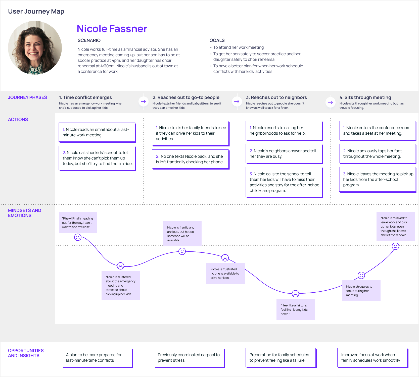
The second user persona considers the other half of the target audience, which is working parents. Nicole Fassner is a mom who works full-time. She has two young kids who are involved in after-school activities. Her frustrations lie mostly in the difficulty of managing her work and family schedules. Her work and kids’ activities often overlap times, and she struggles to get her children to their activities—let alone to get them there on time.
Point of View
User Nicole is a caring mom who works full-time and hopes to effectively manage her work and family schedules. She wants to spend less time driving while assuring that her kids get to their activities safely.
This point of view statement defines the target user and their unmet need. Generally, the target user is a caring but busy parent who struggles to manage family schedules and wants to get their children to their activities safely.
Journey Map
The following journey map breaks down the process of a problem user Nicole is facing. Creating this map kindled empathy for the user and helped further identify areas of inconvenience and opportunity in the user's experience.
How Might We?
• How might we improve coordinating carpool for parents so they feel less stressed about driving their kids?
• How might we reduce the amount of time parents spend waiting in the school carpool line to pick up their children?
• How might we assist parents in scheduling safe and trustworthy carpools for their kids?
These question statements guided the execution of a solution. During the design process, these questions ensured the project was staying on task.
Design Concept
We will design a carpool service that is organized and helpful so that parents can effectively manage family schedules and feel prepared, in control, and less stressed.
The above design concept also guided the design process to ensure the solution would be helpful to parents by giving them feelings of preparation and control.
Ideation
Data and research informed idea generation for a solution. Here are some of these ideas:
• To remain in the group, parents must commit to driving a certain amount
• Groups for neighborhoods, sports teams, school pickup
• Location tracking
• Event calendar/schedule
• Driver stats to show who is driving the most
• Notifications
• Information about the trip (duration, time)
• Information about each driver's car & safety ratings
• Location tracking
• Alerts for kids with phones so they know who to ride home with
• Compatibility with school carpool
• Last-minute emergency ride requests
Wireframes
Below are some initial wireframes for app screens that each target a specific issue found in the research. The app is called Caravan to hint at its association with group transportation.
Mid-Fidelity Prototypes
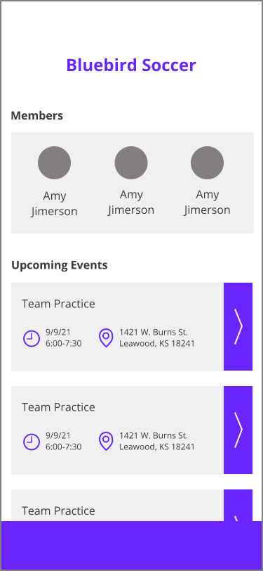
Group Page
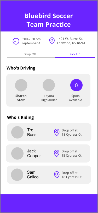
Pick Up
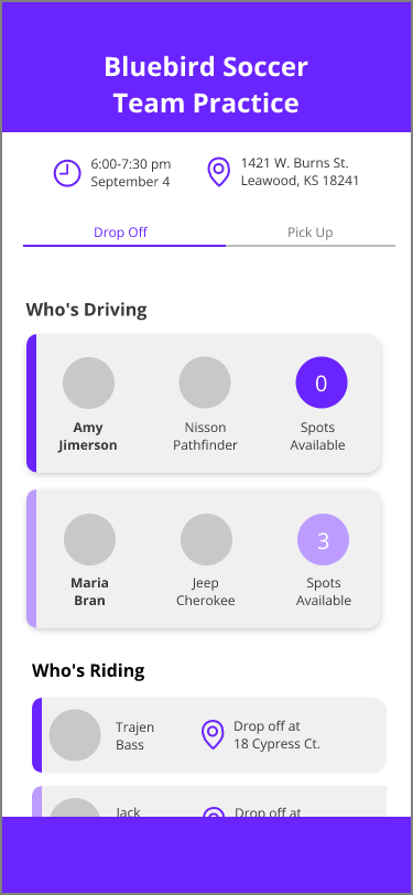
Drop Off
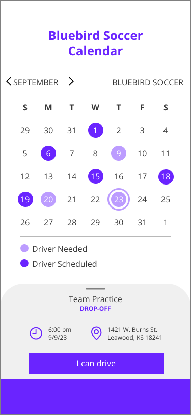
Calendar
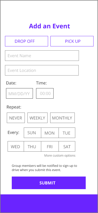
Add an Event
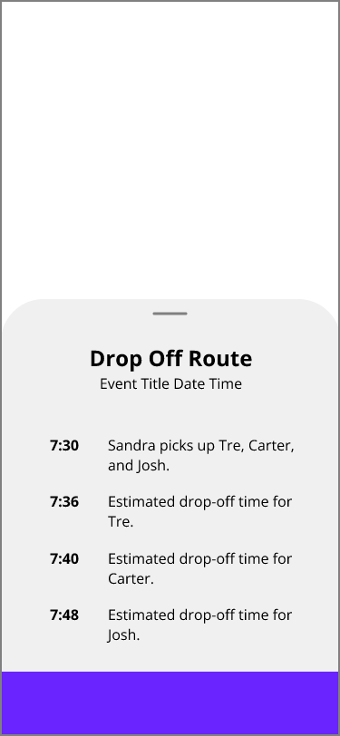
Route
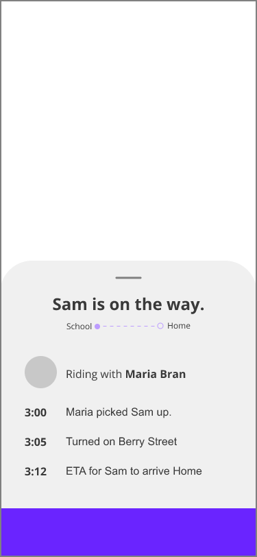
Tracking
Iterations
Feedback from five users included the following points, which were used to iterate screens:
Calendar should differentiate drop-off and pick up
Users should have an option to change which calendar they are viewing
Add back buttons
Add a chat/messages tab
Make the drop off and pick up segment bar stand out more
High-Fidelity Prototypes
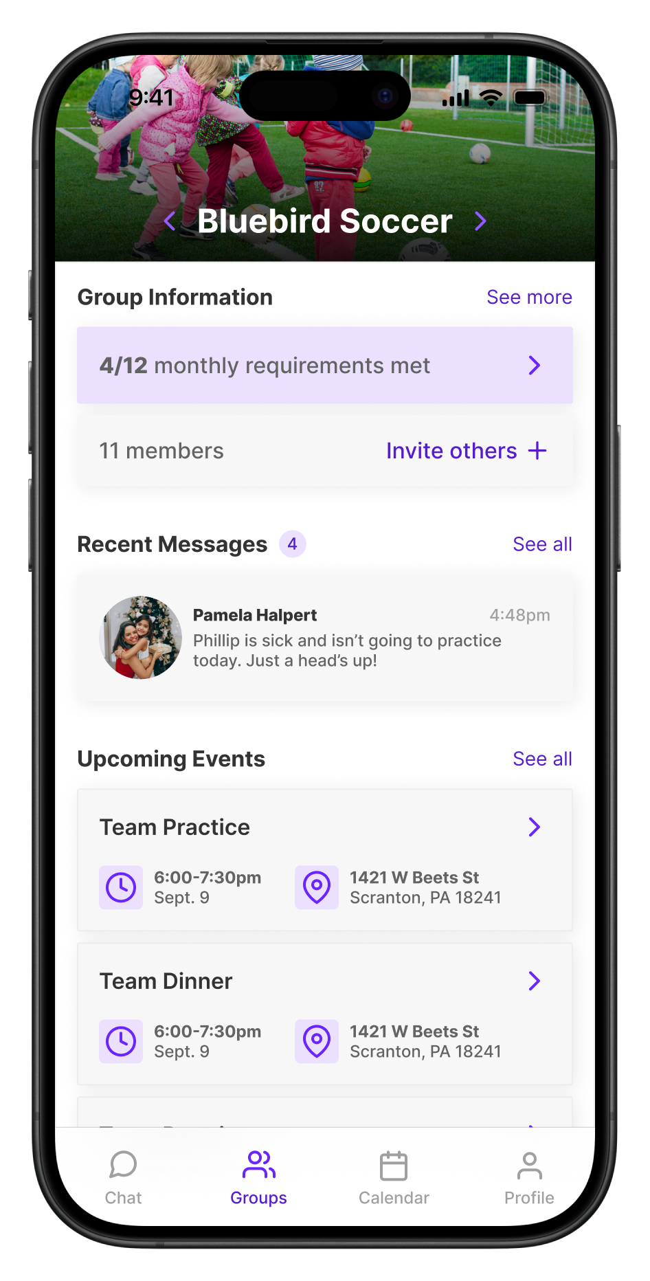
Group Home
Drop off
Pick up
Group Calendar
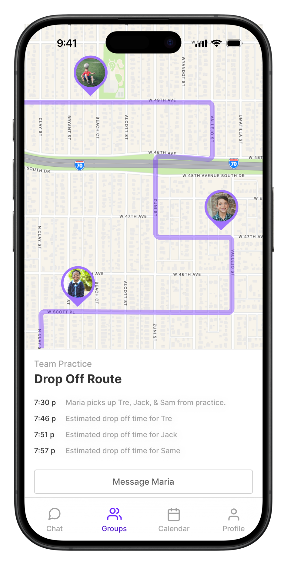
Route
Chat
Add an event
Storyboard
The following storyboard demonstrates the role of Caravan in transforming a busy parents' life; it walks through the circumstances and emotional journey of the problem from start to finish and is intended to reflect the story of real users when they discover the Caravan app. Click to enlarge.
Product Story
Once upon a time, there was a hard-working mom named Nicole. Every day, she went to work then immediately picked up her kids from school and drove them to their activities. One day, Nicole’s coworker showed her the Caravan carpool app. Now, because of this app, Nicole confidently and securely schedules carpools for her kids with other parents she knows and trusts. She finally spends less time driving and feels less stressed about managing her work and family schedules.
This product story, based on Nicole's user persona, summarizes the effectiveness of Caravan on users' lives.
Lessons Learned
Careful research builds empathy in the designer. This was my first UX project, and I learned the importance of letting research—not my assumptions or initial ideas—guide my design. Empathy is foundational to this research, which I particularly learned through the development of user personas and a journey map.
Moreover, this project was nice practice in balancing my time spent working on the structure versus the visual design. As a graphic designer, it's tempting to get caught up in the visual details, when in reality, the structure is often far more important. The two certainly go hand-in-hand, but this project timeline required that I direct more of my attention to the UX than the UI.
Thanks for following along!
Thank you for taking the time to explore my design process. If you're interested in a more detailed discussion or have any feedback, please fill out the contact form. As an experience designer, I’m all about feedback, so I’d love to hear your thoughts on my portfolio!


