Squirt Waterpark
A waterpark branded just for your little squirt.
Innovation Center for Design Excellence Logo Competition Silver Medal
Squirt Brand Identity
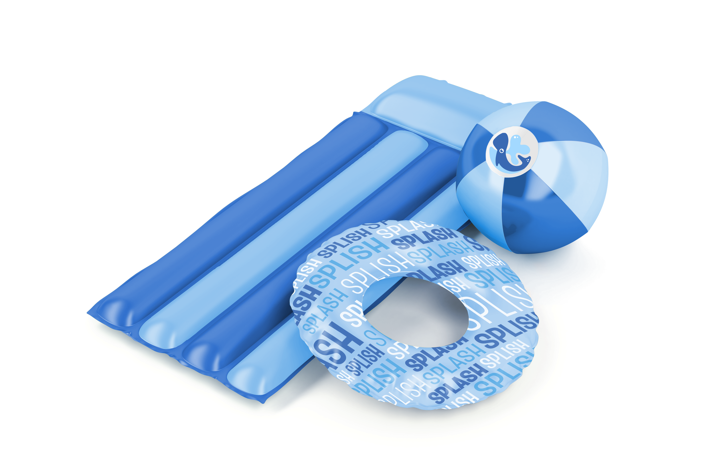
Squirt is a waterpark specifically for little kids. From splash pools to lazy rivers to waterslides, this waterpark is the perfect activity for children. Squirt is exciting, safe, and adventurous, and parents can be confident their kids will be safe at Squirt.
Want to see some of my process?
Primary Logo
The Squirt logo is logo is playful and fun, just like the nature of a waterpark. The flat color and friendly look of the whale imply safety so parents can feel confident their children will be safe at Squirt. The logo can be displayed stacked vertically, horizontally, or with only the icon. The following color combinations are acceptable.
Subsidiary Logos
Squirt has three subsidiaries to brand different sections of the waterpark: snacks, swim, and slides. All three subsidiary logos mimic the parent logo through flat color, similar highlights, and the form of the animal’s eye.
Brand Colors
Secondary Colors

PMS P 40-8 C CMYK 0, 60, 96, 0 RGB 255, 131, 30 HEX #FF831E

PMS P 20-7 C CMYK 0, 36, 100, 0 RGB 255, 174, 0 HEX #FFAE00

PMS P 4-5 C CMYK 2, 6, 68, 0 RGB 253, 229, 112 HEX #FDE570

PMS P 126-5 C CMYK 75, 22, 42, 1 RGB 61, 153, 152 HEX #3D9998

PMS P 147-2 C CMYK 62, 12, 58, 0 RGB 103, 174, 136 HEX #67AE88

PMS P 142-5 C CMYK 49, 0, 45, 0 RGB 126, 213, 167 HEX #7ED5A7

PMS P 83-7 C CMYK 48, 77, 0, 0 RGB 165, 76, 150 HEX #A251D6

PMS P 83-4 C CMYK 23, 44, 0, 0 RGB 199, 151, 230 HEX #C797E6
Typography
The display typeface, Truculenta, should only be used for headlines and decorative type. All body copy should be set in Museo Sans, unless on Microsoft, in which case Century Gothic Regular and Bold can be used.
Design Elements: Stacked Type
The display typeface, Truculenta, should only be used for headlines and decorative type. All body copy should be set in Museo Sans, unless on Microsoft, in which case Century Gothic can be used.
Design Elements: Splash Texture
The splashes should always be darker than the background. Shown to the right are acceptable color combinations. Splashes should always be flat color.


